A mobile menu does not show when its setting is off, when the screen is wider than the collapse width, or when no menu is assigned. A menu button that shows but does not open points to a script that fails on the page.
The Menu Button Does Not Show
Check your theme’s settings first. Each setting below must be enabled.
Ultra
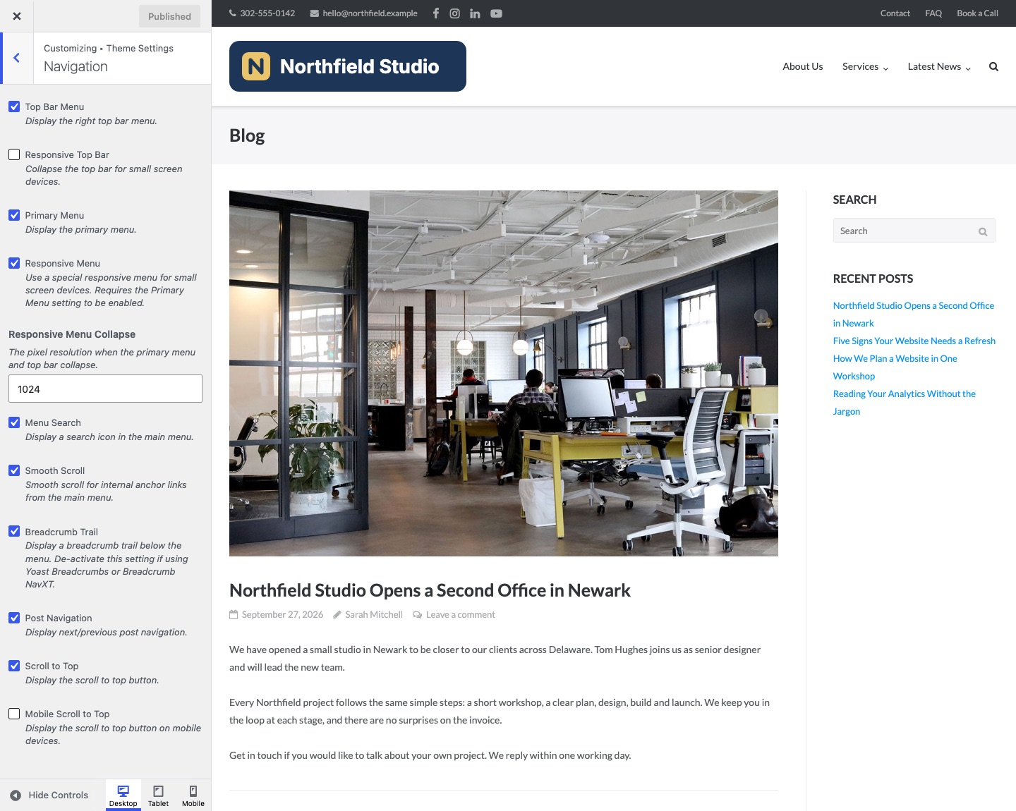
- AppearanceCustomizeTheme SettingsNavigation: Primary Menu and Responsive Menu. Both are on by default.
- AppearanceCustomizeTheme SettingsLayout: Responsive Layout. It is on by default.
Puro Theme
- AppearanceCustomizeTheme SettingsNavigation: Header Menu and Mobile Menu. Both are on by default.
- AppearanceCustomizeTheme SettingsLayout: Responsive Layout. It is on by default.
Polestar
- AppearanceCustomizeTheme SettingsNavigation: Header Menu and Mobile Menu. Both are on by default.
- Polestar hides its own menu button when UberMenu is active, or when Max Mega Menu is enabled for the Header Menu location. Use the mobile toggle of that plugin, or turn the plugin off for that location.
The Menu Shows on Phones but Not on Tablets
The menu turns into a button only below a set width. A tablet wider than that width shows the full menu. Raise the width to change this.
- Ultra: Responsive Menu Collapse in Theme Settings > Navigation. The default is 1024 pixels.
- Puro theme: Mobile Menu Collapse in Theme Settings > Navigation. The default is 768 pixels.
- Polestar: the free theme collapses the menu at 780 pixels. Polestar Premium adds Mobile Menu Collapse in Theme Settings > Navigation. The range is 480 to 3000 pixels.
Each theme prints the collapse width as inline CSS in the page head. Clear your page cache after you change it.
The Menu Is Off or Empty
Ultra and the Puro theme hide the menu button when the navigation holds no menu list. In Ultra that happens when Primary Menu is off. In the Puro theme, turning Header Menu off removes the navigation and the button.
A menu location with no menu assigned shows a list of your pages. To use your own menu, go to AppearanceMenus and assign it to the menu location. The location is named Primary Menu in Ultra and the Puro theme, and Header Menu in Polestar. See Menus.
The Button Shows but the Menu Does Not Open
The theme script that opens the menu does not run. In Ultra and the Puro theme the file is responsive-menu.min.js. In Polestar it is jquery.theme.min.js.
- Open the page in a private browser window and press F12 to open the developer tools.
- Reload the page and open the Console tab. A red error that names a plugin file points to that plugin.
- In your caching or optimization plugin, turn off minify, combine, defer and delay for JavaScript. Clear its cache and test again.
- If the error stays, turn off all plugins and turn them on one at a time. See Resolving Plugin Conflicts.
Fix a Mobile Menu in Any Theme
- Assign a menu. Go to AppearanceMenus, open Manage Locations and assign a menu to the mobile or primary location of your theme. In a block theme, open Appearance > Editor and check that the Navigation block in the header has a menu.
- Test the page without optimization. Turn off the minify, combine, defer and delay options for JavaScript in your caching or optimization plugin. Clear your caching plugin’s cache and reload.
- Check the console. Open the page in a private browser window. Right-click the element and choose Inspect. In Safari, turn on the Develop menu first and choose Inspect Element. Open the Console tab and reload. A red error stops scripts that run after it. The file name in the error points to the theme or plugin that fails.
- Check for a CSS rule that hides the button. In the developer tools, select the menu button in the Elements tab. Look at the Styles pane for
display: noneorvisibility: hiddenon the button or on its parent. Check whether the rule sits inside a media query that matches your screen width. - Check the breakpoint. Use the device toolbar of the developer tools to set the screen width. Each theme switches to the mobile menu at its own width. A tablet can be wider than that width.
If the button is hidden by an unwanted rule, override it with a rule scoped to the same selector. The class name below is an example. Use the one that you found:
@media (max-width: 768px) {
	.site-header .menu-toggle {
		display: block;
	}
}
Add the rule at AppearanceCustomizeAdditional CSS in a classic theme. A block theme has no Customize screen. There, go to AppearanceEditor, click Styles, open the three-dot More menu and choose Additional CSS. Click Publish or Save. A rule that overrides the theme needs a selector at least as specific as the original. Use !important only if a rule with inline styles wins.
Related
- Ultra Navigation Settings
- Puro Theme Navigation Settings
- Polestar Navigation Settings
- Resolving Plugin Conflicts