Here is a quick solution for displaying menu items in your mobile menu and not in your regular desktop menu.
1. We’ll be using the lightweight and simple plugin: If Menu. Download from the link or go to PluginsAdd New and search for If Menu. Install and activate.
2. Go AppearanceMenus and select the menu you’d like to edit. This plugin has lots of possibilities. In this tutorial, we’re just going to look at displaying a menu item for our mobile device users only.
3. Pick a menu item and edit it. Click the checkbox to Enable visibility rules. Finally, use the drop-down to either Show or Hide the menu item based on the visibility condition. Click the + plus icon if you’d like to add more than one visibility condition.
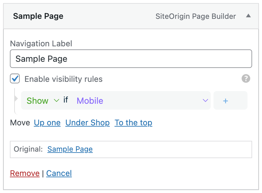
That’s it! The menu item will now only appear for mobile users. Keep in mind that the conditional statement used is device-dependent. Re-sizing your browser on a desktop won’t reveal the menu item; you’ll need to test it on your mobile device.
If you’d like to conditionally display a menu based on page conditions, we recommend the Conditional Menus plugin.