- This topic has 5 replies, 2 voices, and was last updated 10 years, 4 months ago by
Andrew Misplon.
- AuthorPosts
- February 25, 2016 at 11:04 pm #3117
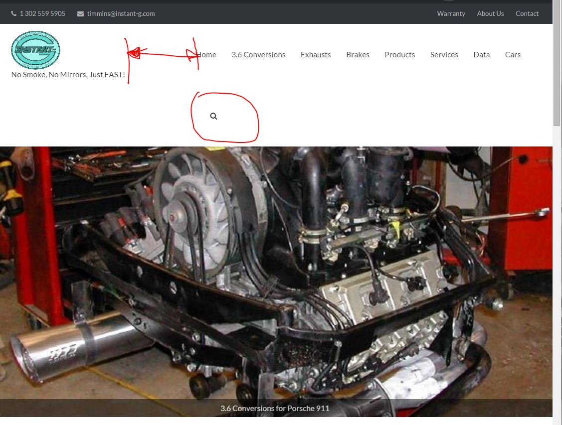
timmins00ParticipantI am trying to set the toggle from normal to mobile responsive menu at the narrowest width possible. Right now I have it set to 1024 and the search icon wraps before it collapses, which is well before the menu runs into the logo/tag. Is there a way to reduce the buffer between the main menu and the logo/tagline area? Hopefully I am being clear. Web site is instant-g.com. Screen shot is at http://www.instant-g.com/OldRoot/buffer.JPG, pardon the primitive graphics. Thanks! Steve
February 26, 2016 at 12:01 pm #3118
Andrew MisplonKeymasterHi timmins00
Thanks for reaching out.
Using a plugin like Simple Custom CSS, please, insert into Appearance > Custom CSS the following:
/* Header */

.site-header .site-branding-container {
	max-width: 21%;
}

.main-navigation {
	max-width: 79%;
}
Once you’ve installed Simple Custom CSS the Appearance > Custom CSS menu item will be available.
Hopefully the above helps 🙂
February 26, 2016 at 12:46 pm #3119
timmins00ParticipantAwesomeness. You even fiddled with the exact percentages! Thanks so much!
February 26, 2016 at 12:48 pm #3120
timmins00ParticipantActaully..that changes things but does not do what I would like. Is it possible to do that as a hard pixel limit? What this did was maintain the padding and wrap the tag line.
February 26, 2016 at 5:14 pm #3121
Andrew MisplonKeymasterHow about this:
1. Change your Custom CSS to:
/* Header */

.site-header .site-branding-container {
	min-width: 236px;
	max-width: 21%;
}

.main-navigation {
	max-width: 79%;
}
2. Change the mobile menu collapse in Theme Settings to 936. Does that work for you?
February 26, 2016 at 5:26 pm #3122
Andrew MisplonKeymasterTopic moved to email. Thanks 🙂
- AuthorPosts
You must be logged in to reply to this topic.