- This topic has 17 replies, 3 voices, and was last updated 7 years, 4 months ago by
Andrew Misplon.
- AuthorPosts
- July 6, 2017 at 8:54 pm #7200
jfcyrParticipantHello
I am using WPML to manage my site translations. I am currently using a language switcher in my main menu rightmost position. (http://reflexphotonics.com).
My problem is that the dropdown language menu is much too wide for its current content. I have found some css in the WPML forums that is supposed to eliminate this issue.
li.wpml-ls-menu-item ul li a {
width: auto;
}
Unfortunately it doesn’t not work. I suspect that there is conflict with the theme. Can you help ?
As a side questions, how can you make the last menu to the right fly out to the left (towards the center of the page).
ThanksJuly 7, 2017 at 2:37 am #7212
Andrew MisplonKeymasterHi 🙂
Please, can you give this a try: https://purothemes.com/documentation/ultra-theme/menu-locations/#heading-changing-drop-down-menu-direction and let me know if the documentation makes sense and works for you. Thanks.
July 7, 2017 at 3:09 pm #7229
jfcyrParticipantHello
The document is all well and good and takes care of the behavior of the fly-out menus
BUT
WPML langage switcher is not a regular menu and is not managed by the functions found in the usual Appearance->Menus. It is simply not there as a menu.
As I said previously, I suspect there is some kind of conflict between the way menus are managed in the theme and the way the language switcher is managed by WPML.
All I found on WPML forums are bits of css to reduce the width go the dropdown (see initial question).
None have worked.
Further reading on this problem brought this “answer” (https://wpml.org/forums/topic/dropdown-box-width-as-menu-item/):
As I said before, it seems that the width of the child item in the menu is set to a certain value (other child menu items, not from the language switcher, probably have the same width, at least the minimum width). You’ll need to specify the class that is responsible for this setting and overwrite it for the language switcher child items.
Can you help with this ?July 8, 2017 at 6:57 am #7235
Andrew MisplonKeymasterThanks for explaining further. I’ll get a copy of WPML and help resolve this one way or another. If you could wait until Monday that would be most appreciated.
July 8, 2017 at 7:05 am #7237
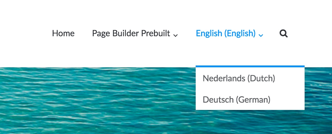
Andrew MisplonKeymasterAt the moment I’m unable to replicate the issue. The switcher on both your site and my demo site seems ok. Below is what I see in my demo:

Can you perhaps screenshot the issue you’re having so I can try and recreate it on my side? Thanks.
My problem is that the dropdown language menu is much too wide for its current content.
If I could see that issue it would help me recreate it.
July 8, 2017 at 1:30 pm #7238
jfcyrParticipant
As you can see, my menu seems to be the same width as yours, but the text I use is shorter. So I am expecting the menu to be narrower.July 8, 2017 at 2:03 pm #7239
Andrew MisplonKeymasterHi. Yes, that’s the standard min-width of all sub menu items in the main menu. The min width is the same whether this menu item is added from the normal menu interface or by WPML. We can try reducing it with Custom CSS. I’ll take a look when back at my computer.
July 8, 2017 at 3:08 pm #7240
Andrew MisplonKeymasterYou can try the following inserted into Custom CSS to set the width, manually, of the WPML drop-down:
.main-navigation .wpml-ls-item .sub-menu {
	width: 125%;
}
July 8, 2017 at 4:06 pm #7241
jfcyrParticipantBrilliant! That is perfect
How do we have the menu fly out to the left now?July 9, 2017 at 5:49 am #7243
Andrew MisplonKeymasterYou can try, including the original rule we added:
.main-navigation .wpml-ls-item .sub-menu {
	width: 140%;
}
.main-navigation ul li.wpml-ls-item ul {
	left: initial;
	left: auto;
	right: 0;
	text-align: right;
}
.main-navigation ul li.wpml-ls-item ul ul {
	right: 100%;
}
July 10, 2017 at 12:57 pm #7245
jfcyrParticipantWe are not quite there yet.:
With the latest css, the dropdown aligns to the right of the menu text, but the submenu text moves out of the box to the right of it menu…

Furthermore the “blue box” for selected menu extends all the way.

Note that even with the first addition to the css (to control the width) the problem of the “selected menu” box was present:
 July 10, 2017 at 2:47 pm #7246
Andrew MisplonKeymasterFor some reason your site is rendering differently to my local copy. Try, as a complete set of rules for this question:
.main-navigation .wpml-ls-item .sub-menu {
	width: 140%;
}
.main-navigation ul li.wpml-ls-item ul {
	left: initial;
	left: auto;
	right: 0;
	text-align: right;
}
.main-navigation ul li.wpml-ls-item ul ul {
	right: 100%;
}
.main-navigation ul li.wpml-ls-item ul li {
	text-align: left;
	min-width: auto;
}
July 10, 2017 at 2:54 pm #7247
jfcyrParticipantAll seems to behave as expected now. I only get a caution in the css that does not seem to create problems:

Many thanks
July 10, 2017 at 2:57 pm #7248
Andrew MisplonKeymasterAhh! Please, try:
.main-navigation .wpml-ls-item .sub-menu {
	width: 140%;
}
.main-navigation ul li.wpml-ls-item ul {
	left: initial;
	left: auto;
	right: 0;
	text-align: right;
}
.main-navigation ul li.wpml-ls-item ul ul {
	right: 100%;
}
.main-navigation ul li.wpml-ls-item ul li {
	min-width: initial;
	text-align: left;
}
Basically, changing
autotoinitial.July 10, 2017 at 3:01 pm #7249
jfcyrParticipantCaution is gone. Great support as usual.
- AuthorPosts
You must be logged in to reply to this topic.