 masshysteri Sep 10, 2017 · 3:47 pm #7728
 Am having issues with a site I’m finalizing that runs Ultra and SiteOrigin. On Chrome the start page displays correctly with four logos listed as features and two separate rows below. But when viewed in Safari the logos and text bleed into the Call-To-Action rows underneath. What can cause this?
Here’s the site: Davma
 Andrew Misplon Puro Sep 11, 2017 · 7:56 am #7734
 Hi
Chrome can be a lot more forgiving in certain situations. Head over to your Custom CSS and remove the fixed height that’s been given to the Features widgets. That should fix the problem 🙂
masshysteri Sep 11, 2017 · 8:21 pm #7740 Thanks for the reply.
I tried removing the fixed height. Didn’t solve the problem in Safari and now my front page in Chrome once again huge unappealing white spaces around the logos. I’m gonna keep the Fixed height off for the moment but unfortunately removing it did not solve my issue. Any other suggestions?
Andrew Misplon Puro Sep 11, 2017 · 8:28 pm #7741 Check the Container and Icon Size settings in the Features widget.
Edit: You can adjust the Container or the Icon size to match your custom icon, I forget exactly which one, I’d need to test locally if you’re unable to find out which one is the setting to use. This will match the icon size to your custom icon.
Andrew Misplon Puro Sep 11, 2017 · 8:31 pm #7743 Within one of the widgets, there is a CSS style set to 50px. This is the issue in Safari, please, try locating and removing this.
50px height has been applied to a widget that applies to both the image and the text, it isn’t enough.
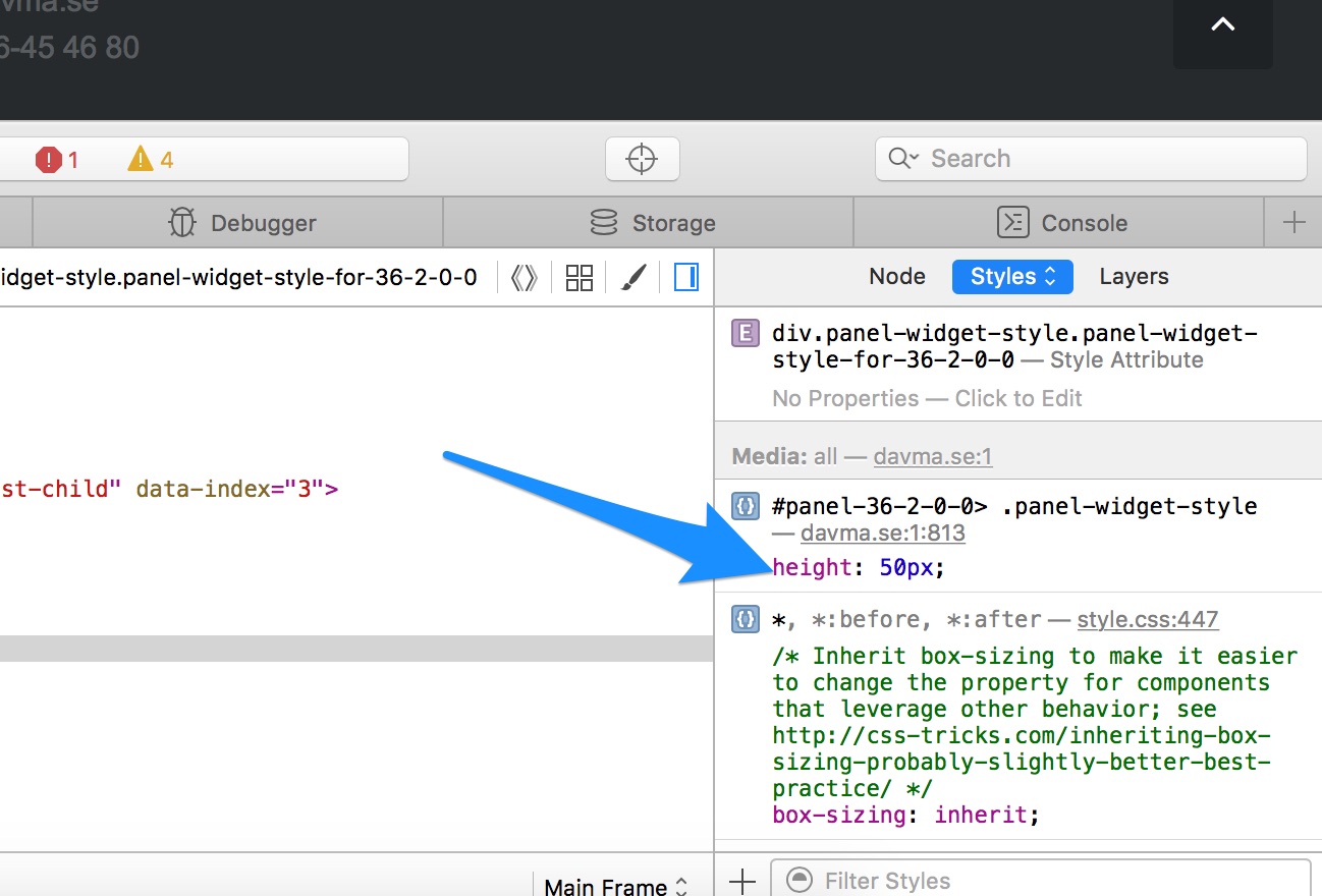
masshysteri Sep 11, 2017 · 8:56 pm #7745 Thank you! After a bit of searching I found the culprit, everything is now working as intended.
Andrew Misplon Puro Sep 11, 2017 · 10:00 pm #7749 Super 🙂 Glad to hear you’ve found the problem. All the best with your site.